|
With the 2021-22 Premier League campaign upon us, it's time to dive into the most exciting thing about the new season: the kits each club will be wearing for the next year. After Euro 2020, the Copa America and the Olympic football tournaments have stolen the focus over the past couple of months, there's a chance you may have missed some of new uniforms unveiled ahead of the new season, which kicks off on Friday. We've seen jerseys inspired by past glories, 1960s modern art movements and even dabbles into psychedelia from a certain north London side. Here we offer a comprehensive guide to the home, away and (where applicable) third alternate kits that all 20 Premier League clubs will be wearing throughout the 2021-22 season. We've compiled each and every one of them here and ranked each club by their collective output from worst to best. As more kits get released, they will be added to the list below and the ranking could change accordingly. - ESPN+ guide: LaLiga, Bundesliga, MLS, FA Cup, more (U.S.)
- Stream ESPN FC Daily on ESPN+ (U.S. only)
- Don't have ESPN? Get instant access
20. Burnley (Umbro)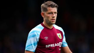 Home: The very un-jazziest of all Premier League sides have added some very jazzy sleeve patterns to their tried-and-tested home kit formula, with unsettling results. Away: The Clarets certainly made us wait for their away kit, unveiling it five days after the 2021-22 season had kicked off. Sky blue pinstripes run over a white base, trimmed in claret, and there's an old-fashioned feel to the jersey with its V-neck and oversized cuffs, but it wasn't really worth the wait. Third: This is more like it. Not only is Burnley's third kit a study in cool navy, it is also a charitable endeavour with the club pledging to donate £5 from ever sale to the Alzheimer's Society -- a donation that will then in turn be matched by their shirt sponsor.
19. Brighton & Hove Albion (Nike) Home: After toying with a daring pinstriped design last season, Brighton are back in their classic blue-and-white stripes once again, thus making their 2021-22 shirt almost indistinguishable from 99% of the club's previous home kits.  Away: The Seagulls' away shirt has more to offer with the aqua colouring similar to that seen on Brighton's Marine Parade, the city's main promenade along the seafront, and the rippled sleeve graphics also reminiscent of a walk by the beach. The lightning-shaped panels that run down either side of the jersey also help to conjure images of the typical weather conditions found on a day trip to the English coast.  Third: Keen-eyed onlookers might have noticed that the Seagulls have cunningly repurposed last season's away kit as their third strip for the 2021-22 season. At least fans who purchased the classic yellow-and-blue combination last year won't have to fork out twice for it.
18. Brentford (Umbro) Home: Brentford are embarking upon their first season in the Premier League with a pair of kits that scream "Premier League new boys." Plain and basic, the Bees' red-and-white striped home shirt is the kind of generic template kit you might see on a local pub's Sunday League team.  Away: The away kit is "buttercup yellow" with a subtle chevron pattern that Umbro says is intended to conjure images of a bee sting. It's a passable effort, but you'd be forgiven for wanting a little more from a club who are trailblazers for the modern data analytics approach in English football. Third: Alas, the Bees' third kit is predictable fare too, with a largely plain white shirt added to the mix. It does at least include a nod to the club's historic roots via the "claret, salmon, and blue" trim on the sleeve cuffs -- the colours first worn when the club was formed in 1889-90 - but they also used these colours as trim for their nigh-on identical white third kit last season.
17. Wolverhampton Wanderers (Castore) Home: New kit suppliers Castore used colour matching to ensure they re-created the precise shade of "Old Gold" that has become synonymous with Wolves over the years. Laser-cut breathing holes in "high sweat zones" and angular side panels add subtle detailing to an otherwise simplistic design. They also went with a shiny matte finish, which makes the shirt look permanently sweaty.  Away: The gold specks against the dark background resemble the dying embers of a fire, which doesn't inspire much confidence in a team facing a pivotal third season back in the top flight under a new manager. Also, the pattern is reminiscent of the infamous 1992-93 "smudge" kit that we hoped had been consigned to history.
16. Leicester City (Adidas) Home: Blotchy and blue, the Foxes have suffered a distinct downgrade from last season's regal gold-fringed home kit. The pattern makes this jersey look like it's made of the kind of fabric generally used to upholster seats on public transport.  Away: The Foxes have gone with mint green for their away kit, which the club rather optimistically claim is "anticipated to be an instant classic." There's a subtle checkerboard pattern integrated into the design, but there's not much to get your teeth into beyond that. "Instantly forgettable" might be a little closer to the mark. Third: The Foxes have slipped into a dusky grey number which falls a little flat despite the retina-searing pink used to accentuate the club crest and trim. As with the club's mint-tinged away kit, this third alternate falls neatly into the "generic" category and is unlikely to be fondly remembered by anyone at the King Power beyond the end of next May.
15. Aston Villa (Kappa) Home: Bound by convention, there's not much wiggle room with a claret-and-blue Villa home shirt in terms of design since they went with those colours in the 1880s, with the club favouring a claret body with blue sleeves without much in the way of deviation in the years since. This season some two-tone vertical stripes have been added into the mix, an ambiguous nod to "past successes of the team," according to the manufacturers. Other than that, it's all a bit humdrum. 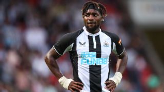 Away: Heralding the 40th anniversary of Villa's European Cup triumph, the new away shirt mirrors the pinstriped white jersey worn against Bayern Munich for the 1981-82 final. The claret detailing gives the jersey a pleasant look but, sentimentality aside, the 2021-22 rehash is a little bland when judged on its own merits. Standard mid-table fare. Third: A design inspired by the lion that adorns the Villa club crest, this deep blue number features a slash of faux claw marks across the front and back. So if you want to look like you've just managed a narrow escape from the big cat enclosure at your local zoo, this kit is for you.
14. Newcastle United (Castore)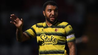 Home: A new manufacturer's logo to the Premier League gives the 2021-22 Newcastle home shirt a vaguely exotic tinge, but it would probably look more at home on a rugby pitch. The mandarin collar is distinctive, but the general lack of stripes is a drawback and the slogan "Better never stops" inside the hem is a bit of a head-scratcher, considering their perennial struggles at the wrong end of the table. Away: For a team who famously play in black-and-white stripes at home, to release a black-and-grey striped away kit seems like folly. However, we can commend the level of detail put in to make Newcastle's 2021-22 alternate shirt visually engaging, with gold crest and sponsor logos and a slick "wave" pattern disrupting the horizontal bands and playing tricks on the eye. Third: This kit is hardly a blockbuster, but the Tron-style symmetrical grid pattern adds some depth and character to the baby blue base colour.
13. Watford (Kelme) Home: Having played in a gruesome mess of black spikes last year, Watford are back in stripes for their return to the Premier League, continuing a proud club tradition of never being able to settle on any one design for more than a season. A slightly paler yellow and hazy "gradient" hoops mean that the Hornets' latest effort is far more comfortable to look at for a sustained length of time than their previous jersey. Away: Watford's away kit is a vivid red jersey with black-and-yellow trim, with the shirt also subtly marbled with a swirl pattern. It looks like something the Belgium national side might have worn in the late 1980s, and for that, it gets a solid thumbs-up from us. Third: Watford have gone all-out to make a statement with this bottle green-and-gold kit, but the reality is that the overzealous zig-zag pattern renders the shirt a bit of an eyesore.
12. West Ham United (Umbro) Home: No prizes for guessing that West Ham have gone with claret and blue once again, though the new sleeve panels and button collar lend a distinct 1990s feel. This is fully deliberate, as the Hammers' new home shirt is directly inspired by their 1999-2000 kit, as worn by Upton Park favourite Paolo Di Canio. Away: Like a West Ham-themed deck chair, the away shirt is pale blue with white stripes, finished off with contrasting bands of claret trim. Again, the club have dug through time in search of inspiration, with the kit intended to evoke memories of the 1992-93 season in which Billy Bonds' side earned promotion into the Premier League. Third: West Ham complete the line-up by shifting their palette around once again, this time choosing a navy marl third shirt decorated with claret-and-sky blue accents on the collar and cuffs. It's fine, if a little predictable.
11. Norwich City (Joma) Home: Norwich have earned promotion again and have kicked off their latest spell in the top flight with a new kit deal with Joma. The Spanish manufacturer's first offering is a familiar yellow-and-green shirt, with the feathery pattern on the sleeves designed to look like the wings of a canary -- the bird on the club's crest from which they take their nickname. The collar is embroidered with the club's six core values (growth, integrity, belonging, resilience, pride and commitment), and the presence of Norfolk-based sports car company Lotus as a main sponsor is a welcome addition. Away: The feathery sleeve pattern is also in place on the away kit, with a deep black and neon turquoise colour scheme giving it a bioluminescent quality. It's moody and nocturnal. We dig it.  Third: The Canaries' third kit is altogether less subtle. In fact, it is fluorescent coral from head to toe with black detailing, including the V-neck and the central stripe. As with the away strip, the third is so powerfully vivid that it nearly functions as its own light source.
10. Southampton (Hummel) Home: Billed as a "kit like no other," the major selling point of Saints' home shirt is that it incorporates augmented reality (AR) technology that allows fans to access a variety of interactive content when they scan it. This rather glosses over the fact that the shirt itself is actually fairly nondescript, even with Hummel's trademark chevrons in the background.  Away: Like many football shirts these days, this one is made from 100% recycled plastic bottles. The Saints emphasised the eco-friendliness of their new away kit by launching it at an event where supporters gathered to clean a beach just a few miles from their St Mary's stadium. The yellow-and-blue jersey bears a tribute to the stadium, as well as the club's former home at The Dell, by including structural details of the two grounds on the inside.  Third: Super smart in black-and-red, the Saints' third shirt also pays homage to the club's stomping grounds by including the same renderings of St Mary's and The Dell, only this time in subtle patterns on the outside of the jersey. Impeccable timing, too: the shirt debuts as the club celebrate the 20-year anniversary of uprooting and moving into their "new" stadium in 2001.
9. Leeds United (Adidas) Home: Fresh as a daisy, the new Leeds home shirt is pristine white with the blue-and-gold trim of 2020-21 replaced with fresh navy and yellow accents. The button-up, collarless look is also a nice touch, with Marcelo Bielsa's side certain to look immaculate as they embark upon their second season back in the top flight. 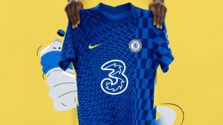 Away: Leeds will play in blue camo on their travels, which Adidas says is intended as an homage to the club's "amazing" away following. In all honesty, it looks more like an homage to Leicester City's 2021-22 home shirt, made by the same manufacturer, although the colour will be agreeable to more fans than the Foxes' mint-green version. Third: Third kit designs tends to afford a little extra creative license which has seen Leeds introduce a brand new colour to their palette. It's kind of hazy heather, kind of luscious lavender, and definitely wouldn't look out of place adorning the walls of the bathroom at your grandmother's house.
8. Chelsea (Nike) Home: Nike says that this kit is inspired by London in the 1960s, specifically the Op-art movement that came to the fore during that time wherein artists created stark abstract and geometric patterns intended to fool the eye. It's hardly a timeless design -- indeed, we have a feeling it's not going to age particularly well -- but you have to commend them for trying something different. 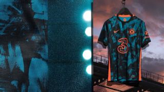 Away: Yellow is the colour for Chelsea on the road once again, with the club returning to an alternate hue favoured since the early 1960s. The horizontal pinstripes also echo several historic Blues away shirts worn during the 1980s and early '90s.  Third: Inspired by the London streetwear scene, Chelsea's third kit features a green and black splotch print accented with crimson trim, all designed to shine under the floodlights on European nights. It's undeniably chic and modern, though you could argue that the last thing the Blues needed to add to their already lively 2021-22 kit collection was another chaotic, abstract design.
7. Manchester City (Puma) Home: City emerged top of our style ranking in 2020-21 with their jerseys of mosaic, paisley and copper trim. However, this summer's kit release is not enough for Guardiola's side to defend their title. It looks like the nostalgia well might be running dry at the Etihad with City's latest home jersey at least part-inspired by Sergio Aguero's famous title-winning goal against Queens Park Rangers -- which was less than a decade ago. The time stamp (93:20) of Aguero's stoppage-time strike on the final day of the 2011-12 season has pride of place in the back of the neck, while the main design is reminiscent of the shirts that City wore that day.  Away: City's away kit is an ecological endeavour, made from 100% recycled plastic while using a special dying process that drastically reduces water usage during its manufacture. This was a decision made by City to highlight water concerns around the world, with the club collaborating with charitable partners to provide clean drinking water, sanitation and hygiene to deprived communities in four cities across three continents. They also knocked out a very smart kit in the process, with the iridescent lettering and logos are an exquisite touch.  Third: This jersey was released as part of Puma's recent mass 2021-22 third kit dump, which has proven very unpopular. Critics have likened the design to lacklustre training wear, with crests removed from chests and replaced with large bands of clunky text. Any City goal scorers seeking to kiss the badge in celebration will have a struggle on their hands, given that it's been relocated to the back of the jersey.
6. Crystal Palace (Puma)Home: Palace unveiled their new home kit with a little help from possibly their only fan old enough to remember the year (1937) the club first switched to red-and-blue stripes. At 101 years old, Pam Blomfield (known affectionately as "Nan Pam") was the unlikely face of the launch after her grandson contacted the club on social media asking to get a shirt for her landmark birthday. The shirt itself sees the Eagles' famous stripes tilted diagonally for the first time, echoing the two-tone sash worn on their white home kits of the 1970s.  Away: A staple for the club's away kits since the 1960s, Palace will be back in yellow on the road this season having chopped and changed between black and white away shirts over the past few years. A return to yellow is likely to prove popular with fans of the Eagles. Speaking of which, there is a large eagle detail sunk into the background of this jersey, while the red-and-blue stripes running vertically down the front to house the club crest are another nice touch.  Third: Sky blue and white aren't colours you'd immediately associate with Palace, but the club have gone back 160 years and untangled their earliest roots in search of creative inspiration. The half-and-half shirt is inspired by the uniform worn in 1861 when Crystal Palace cricket club formed a football team to keep playing sport during the winter months. The shirt is speckled in references to the Eagles' nascent years, including an image of the famous Crystal Palace building -- originally constructed for the Great Exhibition of 1851 -- which has been merged into the design.
5. Everton (Hummel) Home: Hummel says its design is inspired by the ingenious "dazzle" camouflage used to shroud ships in the Liverpool docks and beyond during the First World War. It worked by using angular lines and confusing colours to make it difficult for enemies to determine both the size and orientation of boats while at sea. Should the Toffees' new kit prove as effective, opposing defenders will no doubt have similar problems judging precisely which way Richarlison is facing while he charges around the Goodison pitch.  Away: A black kit furnished with a bright burnt orange sash, the new Everton away kit is a tribute to the team of 1881-82, a side that came to be nicknamed "The Black Watch." That team had a formidable record but, due to a lack of formal league structure, most of their games were classified as non-competitive friendlies, barring two outings in the Lancashire Senior Cup. Still, their kit looked amazing.  Third: Inspired by the Toffees' white away kits of the 1950s, this modern interpretation features a central track of navy and yellow chevrons -- another innovative use of Hummel's trademark logo, even if it does make the shirt look like it's been run over by a motorbike.
4. Tottenham Hotspur (Nike) Home: There's going "back to basics" and then there's this: the whitest shirt and naviest shorts and socks you'll see this season. Some will find this design utterly boring, but when you're a club with such a distinctive combination of colours then you have the luxury of reverting to the classic look. Still, most Spurs fans will be more concerned about star striker Harry Kane's attempts to force an exit late in the transfer window than how much effort has gone into designing their kit.  Away: As if to compensate for their ultra-simplistic home kit, Spurs went all out with the away shirt. In as stark a contrast between a club's kits of the same season as you're likely to find, the second jersey is a chaotically cosmic trip through a mind-bending neon galaxy. The swirling dreamscape has split opinion among Spurs fans right down the middle but, hand on heart, we love it. Third: Spurs risked going one wild kit too far with their lurid purple third jersey with its angular chevrons, chaotic collages, patchy patterns and washed out colours. It was designed in collaboration with local artists as a showcase for the young creative talent emerging in North London.
3. Manchester United (Adidas) Home: The United home shirt is designed to conjure images of club legends like Sir Bobby Charlton, George Best and Denis Law in their pomp. Inspired by the club's classic red home kits of the 1960s with white round collar and cuffs, the plain design is another intended to prompt swells of nostalgia. The past will be something of a refuge for United fans who are having to deal with the club's current four-year trophy drought. Away: United have also gone retro for their new away kit, specifically the cult classic "snowflake" shirt of 1990-92. Just like they did for their 2017-18 away shirt, the old tessellating trefoil pattern has been updated to create a modern take on a fan favourite. Jadon Sancho certainly seems to enjoy being back in pale blue, so who are we to argue? Third: United's new third kit was introduced as a "remix" of the sleek black away kit worn by Eric Cantona & Co. during their historic double-winning 1993-94 campaign. The contemporary revamp chops and changes the palette around with a deep blue base, even darker angular patterning and a high-contrast yellow trim. Looking at both shirts side by side, the correlation isn't immediately apparent -- and it seems a little daft that both of United's alternative outfield kits for 2021-22 are predominantly blue -- but it's still a perfectly nice strip, all things considered.
2. Liverpool (Nike)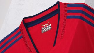 Home: Liverpool have sent a shock wave through their traditional home red this season, intensifying the colour in what Nike calls a testament to former manager Bill Shankly's belief that it made his team play with added vigour. In 1964-65, Shankly introduced an entirely red kit -- shirt, shorts and socks -- at Anfield for the first time, citing the psychological advantages of harnessing the "danger and power" associated with the colour. Sure enough, they went on to win the FA Cup that season. Jurgen Klopp's side will no doubt be looking to reclaim their Premier League dominance by channelling that energy. Away: Liverpool's away kit sees a welcome return for the colour off-white shade "ecru," although here they have dubbed it "stone," inspired by the buildings that dominate the city's skyline. Ecru became synonymous with Liverpool during the 1990s thanks largely to the infamous Armani suits the team wore ahead of the 1995-96 FA Cup final, and the off-beige away strip they wore for the following season, which has since attained "cult classic" status among fans. The contemporary 2021-22 rendering is altogether easier on the eye, with a green-and-red trim bringing the whole thing together nicely. Third: With trim inspired by the chequered flags that first appeared on the Anfield terraces in the 1970s, this kit is a loving tribute to one of football's most famous stands: The Kop. Drenched in vibrant yellow with subtle pinstriping, the shirt harks back to the club's last great flush of success during the 1980s, when the colour became a staple of the Reds' repertoire. Unashamedly retro and steeped in nostalgia, you either love it or you don't -- and we do (even if some see it as too close to the uniform of a fast food outlet for their liking).
1. Arsenal (Adidas) Home: Arsenal have followed up last season's art deco-themed kit by reverting to a clean, modern reworking of their iconic club colours. A vivid red base, white sleeves and flanks are set off by a navy blue trim. It's undoubtedly smart and uncluttered, though there are distinct shades of Ajax about it -- which is never a bad thing in our book. Away: Arsenal will be wearing "pearl citrine" (yellow) and "collegiate navy" (dark blue) on the road with an effortlessly stylish shirt that also sees the club's old and much-loved cannon crest make a long-awaited return. The kit also marks the 50th anniversary of the club's first-ever double-winning season, when Charlie George & Co. wore yellow as they beat Liverpool in the 1971 FA Cup final at Wembley. Third: Continuing the retro theme, Arsenal have resurrected their cult classic "blue lightning" away kit from 1995-96. Breathing new life into a fan favourite, the 2021-22 rework sees the bolt graphic spread right across the shirt, with two shades of blue and a contrasting scarlet outline combining to create a pattern that feels brand new and yet familiar at the same time. Incidentally, the original lightning kit was worn during the last season the Gunners weren't involved in European competition -- until 2021-22, that is.
|